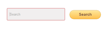
Google Custom Search is just like a dream come true for any Website owner. The ability to provide your readers with Google-like searching power into your website's vast archives that too at no expense. It makes sure readers searching for a specific topic that you published a long time is never missed by them. But there is a shortcoming in terms of designs to choose from. Here I will be showcasing 6 different designs of search boxes which will surely suit your blog.
Do remember to check out the previous
6 Search Box Designs for your Google Custom Search Box I am assuming that you have already setup your Google Search Custom search engine. In case you haven't ,then first check this guide for
setting it up for your blog .There are many variations Google Custom Search with options of AutoComplete and other features but normally looks something like this
<div id="cse" style="width: 100%;">Loading</div> Here you can't really see where to apply the styling as the form tag is dynamically added via JavaScript after the page load. Now the following code also works the same way as the above Code, only thing is that it is easy to
Customize and also loads faster :
<form id="searchbox_XXXXXXXXXXXXXXXXXXXXX:YYYYYYYYYYY" action="URL of the Page where the Result is to be shown"> In the id "searchbox_XXXXXXXXXXXXXXXXXXXXX:YYYYYYYYYYY" ,
XXXXXXXXXXXXXXXXXXXXX:YYYYYYYYYYY is your "Search engine ID" which you can find on the Control panel of your search engine.
If you are using the Adsense linked GCS then your search Box should look something like this:
<form action="URL of the page where the Result open id="cse-search-box"> How to Add it To Blogger: Either you can install it directly using the One-Click Installer or follow the steps below
1.In Your Blogger Dashboard Click Template > Edit HTML
2. Find the following piece of code : (Press Ctrl+F for a search bar to help find the code )
]]></b:skin> 3. Copy and Paste any one of the CSS code that you like from below Directly just Above
]]></b:skin>
4. Now go to Layout > Add a Gadget and add the corresponding HTML of the Search Box code into a HTML/JavaScript Gadget
Note : Search engine unique ID " for the Search box to work.
Design 1 Demo Add using One Click Installer into Blogger Or add it manually CSS .signup { HTML <form id="searchbox_XXXXXXXXXXXXXXXXXXXXX:YYYYYYYYYYY" action="URL of the Page where the Result is to be shown" class="signup"> Design 2 Demo Add using One Click Installer into Blogger <style type="text/css" > //<![CDATA[ .form-wrapper { width: 450px; padding: 8px; margin: 100px auto; overflow: hidden; border-width: 1px; border-style: solid; border-color: #dedede #bababa #aaa #bababa; -moz-box-shadow: 0 3px 3px rgba(255,255,255,.1), 0 3px 0 #bbb, 0 4px 0 #aaa, 0 5px 5px #444; -webkit-box-shadow: 0 3px 3px rgba(255,255,255,.1), 0 3px 0 #bbb, 0 4px 0 #aaa, 0 5px 5px #444; box-shadow: 0 3px 3px rgba(255,255,255,.1), 0 3px 0 #bbb, 0 4px 0 #aaa, 0 5px 5px #444; -moz-border-radius: 10px; -webkit-border-radius: 10px; border-radius: 10px; background-color: #f6f6f6; background-image: -webkit-gradient(linear, left top, left bottom, from(#f6f6f6), to(#eae8e8)); background-image: -webkit-linear-gradient(top, #f6f6f6, #eae8e8); background-image: -moz-linear-gradient(top, #f6f6f6, #eae8e8); background-image: -ms-linear-gradient(top, #f6f6f6, #eae8e8); background-image: -o-linear-gradient(top, #f6f6f6, #eae8e8); background-image: linear-gradient(top, #f6f6f6, #eae8e8); } .form-wrapper #search { width: 330px; height: 20px; padding: 10px 5px; float: left; font: bold 16px 'lucida sans', 'trebuchet MS', 'Tahoma'; border: 1px solid #ccc; -moz-box-shadow: 0 1px 1px #ddd inset, 0 1px 0 #fff; -webkit-box-shadow: 0 1px 1px #ddd inset, 0 1px 0 #fff; box-shadow: 0 1px 1px #ddd inset, 0 1px 0 #fff; -moz-border-radius: 3px; -webkit-border-radius: 3px; border-radius: 3px; } .form-wrapper #search:focus { outline: 0; border-color: #aaa; -moz-box-shadow: 0 1px 1px #bbb inset; -webkit-box-shadow: 0 1px 1px #bbb inset; box-shadow: 0 1px 1px #bbb inset; } .form-wrapper #search::-webkit-input-placeholder { color: #999; font-weight: normal; } .form-wrapper #search:-moz-placeholder { color: #999; font-weight: normal; } .form-wrapper #search:-ms-input-placeholder { color: #999; font-weight: normal; } .form-wrapper #submit { float: right; border: 1px solid #00748f; height: 42px; width: 100px; padding: 0; cursor: pointer; font: bold 15px Arial, Helvetica; color: #fafafa; text-transform: uppercase; background-color: #0483a0; background-image: -webkit-gradient(linear, left top, left bottom, from(#31b2c3), to(#0483a0)); background-image: -webkit-linear-gradient(top, #31b2c3, #0483a0); background-image: -moz-linear-gradient(top, #31b2c3, #0483a0); background-image: -ms-linear-gradient(top, #31b2c3, #0483a0); background-image: -o-linear-gradient(top, #31b2c3, #0483a0); background-image: linear-gradient(top, #31b2c3, #0483a0); -moz-border-radius: 3px; -webkit-border-radius: 3px; border-radius: 3px; text-shadow: 0 1px 0 rgba(0, 0 ,0, .3); -moz-box-shadow: 0 1px 0 rgba(255, 255, 255, 0.3) inset, 0 1px 0 #fff; -webkit-box-shadow: 0 1px 0 rgba(255, 255, 255, 0.3) inset, 0 1px 0 #fff; box-shadow: 0 1px 0 rgba(255, 255, 255, 0.3) inset, 0 1px 0 #fff; } .form-wrapper #submit:hover, .form-wrapper #submit:focus { background-color: #31b2c3; background-image: -webkit-gradient(linear, left top, left bottom, from(#0483a0), to(#31b2c3)); background-image: -webkit-linear-gradient(top, #0483a0, #31b2c3); background-image: -moz-linear-gradient(top, #0483a0, #31b2c3); background-image: -ms-linear-gradient(top, #0483a0, #31b2c3); background-image: -o-linear-gradient(top, #0483a0, #31b2c3); background-image: linear-gradient(top, #0483a0, #31b2c3); } .form-wrapper #submit:active { outline: 0; -moz-box-shadow: 0 1px 4px rgba(0, 0, 0, 0.5) inset; -webkit-box-shadow: 0 1px 4px rgba(0, 0, 0, 0.5) inset; box-shadow: 0 1px 4px rgba(0, 0, 0, 0.5) inset; } .form-wrapper #submit::-moz-focus-inner { border: 0; } //]]> </style> <a href="http://www.stylifyyourblog.com" title="Stylify Your Blog" ><img src="http://img1.blogblog.com/img/blank.gif" /></a> <form class="form-wrapper" id="searchbox_XXXXXXXXXXXXXXXXXXXXX:YYYYYYYYYYY" action="URL of the Page where the Result is to be shown" > <input type="text" id="search" placeholder="Search for " ><input type="submit" value="go" id="submit"> </form> Or add it manually CSS .form-wrapper { HTML <form class="form-wrapper" id="searchbox_XXXXXXXXXXXXXXXXXXXXX:YYYYYYYYYYY" action="URL of the Page where the Result is to be shown" > Design 3 Demo Add using One Click Installer into Blogger <style type="text/css" > //<![CDATA[ .cf:before, .cf:after{ content:""; display:table; } .cf:after{ clear:both; } .cf{ zoom:1; } .form-wrapper { width: 450px; padding: 15px; margin: 150px auto 50px auto; background: #f9f9f9 !important; -moz-border-radius: 10px; -webkit-border-radius: 10px; border-radius: 10px; -moz-box-shadow: 0 1px 1px rgba(0,0,0,.4) inset, 0 1px 0 rgba(255,255,255,.2); -webkit-box-shadow: 0 1px 1px rgba(0,0,0,.4) inset, 0 1px 0 rgba(255,255,255,.2); box-shadow: 0 1px 1px rgba(0,0,0,.4) inset, 0 1px 0 rgba(255,255,255,.2); } .form-wrapper input { width: 330px; height: 20px; padding: 10px 5px; float: left; font: bold 15px 'lucida sans', 'trebuchet MS', 'Tahoma'; border: 0; background: #eee; -moz-border-radius: 3px 0 0 3px; -webkit-border-radius: 3px 0 0 3px; border-radius: 3px 0 0 3px; } .form-wrapper input:focus { outline: 0; background: #fff; -moz-box-shadow: 0 0 2px rgba(0,0,0,.8) inset; -webkit-box-shadow: 0 0 2px rgba(0,0,0,.8) inset; box-shadow: 0 0 2px rgba(0,0,0,.8) inset; } .form-wrapper input::-webkit-input-placeholder { color: #999; font-weight: normal; font-style: italic; } .form-wrapper input:-moz-placeholder { color: #999; font-weight: normal; font-style: italic; } .form-wrapper input:-ms-input-placeholder { color: #999; font-weight: normal; font-style: italic; } .form-wrapper button { overflow: visible; position: relative; float: right; border: 0; padding: 0; cursor: pointer; height: 40px; width: 110px; font: bold 15px/40px 'lucida sans', 'trebuchet MS', 'Tahoma'; color: #fff; text-transform: uppercase; background: #d83c3c; -moz-border-radius: 0 3px 3px 0; -webkit-border-radius: 0 3px 3px 0; border-radius: 0 3px 3px 0; text-shadow: 0 -1px 0 rgba(0, 0 ,0, .3); } .form-wrapper button:hover{ background: #e54040; } .form-wrapper button:active, .form-wrapper button:focus{ background: #c42f2f; } .form-wrapper button:before { content: ''; position: absolute; border-width: 8px 8px 8px 0; border-style: solid solid solid none; border-color: transparent #d83c3c transparent; top: 12px; left: -6px; } .form-wrapper button:hover:before{ border-right-color: #e54040; } .form-wrapper button:focus:before{ border-right-color: #c42f2f; } .form-wrapper button::-moz-focus-inner { border: 0; padding: 0; } //]]> </style> <a href="http://www.stylifyyourblog.com" title="Stylify Your Blog" ><img src="http://img1.blogblog.com/img/blank.gif" /></a> <form class="form-wrapper cf" id="searchbox_XXXXXXXXXXXXXXXXXXXXX:YYYYYYYYYYY" action="URL of the Page where the Result is to be shown" > <input type="text" placeholder="Search here..." required><button type="submit">Search</button></form> Or add it manually CSS .cf:before, .cf:after{ HTML <form class="form-wrapper cf" id="searchbox_XXXXXXXXXXXXXXXXXXXXX:YYYYYYYYYYY" action="URL of the Page where the Result is to be shown" > Design 4 Demo Add using One Click Installer into Blogger <style type="text/css" > //<![CDATA[ .box.login { width:332px; } .box input[type=text], .txtField, .cjComboBox { border:6px solid #F7F9FA; -webkit-border-radius:3px; -moz-border-radius:3px; border-radius:3px; -moz-box-shadow:2px 3px 3px rgba(0, 0, 0, 0.06) inset, 0 0 1px #95a2a7 inset; -webkit-box-shadow:2px 3px 3px rgba(0, 0, 0, 0.06) inset, 0 0 1px #95a2a7 inset; box-shadow:2px 3px 3px rgba(0, 0, 0, 0.06) inset, 0 0 1px #95a2a7 inset; margin:3px 0 4px; padding:8px 6px; width:205px; float:left; display:block; } .box input[type=text]:focus, .txtField:focus, .cjComboBox:focus { border:6px solid #f0f7fc; -moz-box-shadow:2px 3px 3px rgba(0, 0, 0, 0.04) inset, 0 0 1px #0d6db6 inset; -webkit-box-shadow:2px 3px 3px rgba(0, 0, 0, 0.04) inset, 0 0 1px #0d6db6 inset; box-shadow:2px 3px 3px rgba(0, 0, 0, 0.04) inset, 0 0 1px #0d6db6 inset; color:#333; } .cjComboBox { width:294px; } .cjComboBox.small { padding:3px 2px 3px 6px; width:100px; border-width:3px !important; } .txtField.small { padding:3px 6px; width:200px; border-width:3px !important; } .box a{color:#999;} .box a:hover, .box a:focus{text-decoration:underline;} .box a:active{color:#f84747;} .btnLogin { -moz-border-radius:2px; -webkit-border-radius:2px; border-radius:15px; background:#a1d8f0; background:-moz-linear-gradient(top, #badff3, #7acbed); background:-webkit-gradient(linear, left top, left bottom, from(#badff3), to(#7acbed)); -ms-filter: "progid:DXImageTransform.Microsoft.gradient(startColorStr='#badff3', EndColorStr='#7acbed')"; border:1px solid #7db0cc !important; cursor: pointer; font:bold 11px/14px Verdana, Tahomma, Geneva; text-shadow:rgba(0,0,0,0.2) 0 1px 0px; color:#fff; -moz-box-shadow:inset rgba(255,255,255,0.6) 0 1px 1px, rgba(0,0,0,0.1) 0 1px 1px; -webkit-box-shadow:inset rgba(255,255,255,0.6) 0 1px 1px, rgba(0,0,0,0.1) 0 1px 1px; box-shadow:inset rgba(255,255,255,0.6) 0 1px 1px, rgba(0,0,0,0.1) 0 1px 1px; margin-top: 10px; float:right; padding:7px 21px; } .btnLogin:hover, .btnLogin:focus, .btnLogin:active{ background:#a1d8f0; background:-moz-linear-gradient(top, #7acbed, #badff3); background:-webkit-gradient(linear, left top, left bottom, from(#7acbed), to(#badff3)); -ms-filter: "progid:DXImageTransform.Microsoft.gradient(startColorStr='#7acbed', EndColorStr='#badff3')"; } .btnLogin:active { text-shadow:rgba(0,0,0,0.3) 0 -1px 0px; } //]]> </style> <a href="http://www.stylifyyourblog.com" title="Stylify Your Blog" ><img src="http://img1.blogblog.com/img/blank.gif" /></a> <form class="box login" id="searchbox_XXXXXXXXXXXXXXXXXXXXX:YYYYYYYYYYY" action="URL of the Page where the Result is to be shown" > <input type="text" tabindex="1" placeholder="Search" > <input type="submit" class="btnLogin" value="Search" > </form> Or add it manually CSS .box.login HTML <form class="box login" id="searchbox_XXXXXXXXXXXXXXXXXXXXX:YYYYYYYYYYY" action="URL of the Page where the Result is to be shown" > Design 5 Demo Add using One Click Installer into Blogger <style type="text/css" > //<![CDATA[ .login-form { width: 300px; margin: 0 auto; } .login-form { padding: 0 30px 25px 30px; } /* Input field */ .login-form .input { width: 46%; padding: 15px 25px; font-family: "HelveticaNeue-Light", "Helvetica Neue Light", "Helvetica Neue", Helvetica, Arial, "Lucida Grande", sans-serif; font-weight: 400; font-size: 14px; color: #9d9e9e; text-shadow: 1px 1px 0 rgba(256,256,256,1.0); background: #fff; border: 1px solid #fff; border-radius: 5px; box-shadow: inset 0 1px 3px rgba(0,0,0,0.50); -moz-box-shadow: inset 0 1px 3px rgba(0,0,0,0.50); -webkit-box-shadow: inset 0 1px 3px rgba(0,0,0,0.50); } /* Second input field */ .login-form .password, .login-form .pass-icon { margin-top: 25px; } .login-form .input:hover { background: #dfe9ec; color: #414848; } .login-form .input:focus { background: #dfe9ec; color: #414848; box-shadow: inset 0 1px 2px rgba(0,0,0,0.25); -moz-box-shadow: inset 0 1px 2px rgba(0,0,0,0.25); -webkit-box-shadow: inset 0 1px 2px rgba(0,0,0,0.25); } input:focus + div{ left: -46px; } /* Animation */ .input, .user-icon, .pass-icon, .button, .register { transition: all 0.5s ease; -moz-transition: all 0.5s ease; -webkit-transition: all 0.5s ease; -o-transition: all 0.5s ease; -ms-transition: all 0.5s ease; } /* Login button */ .login-form .button { float:right; padding: 11px 25px; font-family: 'Bree Serif', serif; font-weight: 300; font-size: 18px; color: #fff; text-shadow: 0px 1px 0 rgba(0,0,0,0.25); background: #56c2e1; border: 1px solid #46b3d3; border-radius: 5px; cursor: pointer; box-shadow: inset 0 0 2px rgba(256,256,256,0.75); -moz-box-shadow: inset 0 0 2px rgba(256,256,256,0.75); -webkit-box-shadow: inset 0 0 2px rgba(256,256,256,0.75); } .login-form .button:hover { background: #3f9db8; border: 1px solid rgba(256,256,256,0.75); box-shadow: inset 0 1px 3px rgba(0,0,0,0.5); -moz-box-shadow: inset 0 1px 3px rgba(0,0,0,0.5); -webkit-box-shadow: inset 0 1px 3px rgba(0,0,0,0.5); } .login-form .button:focus { position: relative; bottom: -1px; background: #56c2e1; box-shadow: inset 0 1px 6px rgba(256,256,256,0.75); -moz-box-shadow: inset 0 1px 6px rgba(256,256,256,0.75); -webkit-box-shadow: inset 0 1px 6px rgba(256,256,256,0.75); } //]]> </style> <a href="http://www.stylifyyourblog.com" title="Stylify Your Blog" ><img src="http://img1.blogblog.com/img/blank.gif" /></a> <form class="login-form" id="searchbox_XXXXXXXXXXXXXXXXXXXXX:YYYYYYYYYYY" action="URL of the Page where the Result is to be shown" > <input name="username" type="text" class="input username" placeholder="Search" /><input type="submit" name="submit" value="Search" class="button" /> </form> Or add it manually CSS .login-form { HTML <form class="login-form" id="searchbox_XXXXXXXXXXXXXXXXXXXXX:YYYYYYYYYYY" action="URL of the Page where the Result is to be shown" > Design 6 Demo Add using One Click Installer into Blogger <style type="text/css" > //<![CDATA[ #contentz { width: 400px; } #contentz:after, #contentz:before { background: #f9f9f9; background: -moz-linear-gradient(top, rgba(248,248,248,1) 0%, rgba(249,249,249,1) 100%); background: -webkit-linear-gradient(top, rgba(248,248,248,1) 0%,rgba(249,249,249,1) 100%); background: -o-linear-gradient(top, rgba(248,248,248,1) 0%,rgba(249,249,249,1) 100%); background: -ms-linear-gradient(top, rgba(248,248,248,1) 0%,rgba(249,249,249,1) 100%); background: linear-gradient(top, rgba(248,248,248,1) 0%,rgba(249,249,249,1) 100%); filter: progid:DXImageTransform.Microsoft.gradient( startColorstr='#f8f8f8', endColorstr='#f9f9f9',GradientType=0 ); border: 1px solid #c4c6ca; content: ""; display: block; height: 100%; left: -1px; position: absolute; width: 100%; } #contentz:after { -webkit-transform: rotate(2deg); -moz-transform: rotate(2deg); -ms-transform: rotate(2deg); -o-transform: rotate(2deg); transform: rotate(2deg); content: ""; top: 0; z-index: -1; } #contentz:before { -webkit-transform: rotate(-3deg); -moz-transform: rotate(-3deg); content: ""; -ms-transform: rotate(-3deg); -o-transform: rotate(-3deg); transform: rotate(-3deg); top: 0; z-index: -2; } #contentz form { margin: 0 20px; position: relative } #contentz form input[type="text"] { -webkit-border-radius: 3px; -moz-border-radius: 3px; -ms-border-radius: 3px; -o-border-radius: 3px; border-radius: 3px; -webkit-box-shadow: 0 1px 0 #fff, 0 -2px 5px rgba(0,0,0,0.08) inset; -moz-box-shadow: 0 1px 0 #fff, 0 -2px 5px rgba(0,0,0,0.08) inset; -ms-box-shadow: 0 1px 0 #fff, 0 -2px 5px rgba(0,0,0,0.08) inset; -o-box-shadow: 0 1px 0 #fff, 0 -2px 5px rgba(0,0,0,0.08) inset; box-shadow: 0 1px 0 #fff, 0 -2px 5px rgba(0,0,0,0.08) inset; -webkit-transition: all 0.5s ease; -moz-transition: all 0.5s ease; -ms-transition: all 0.5s ease; -o-transition: all 0.5s ease; transition: all 0.5s ease; background: #EAE7E7; border: 1px solid #C8C8C8; color: #777; width: 56%; font: 13px Helvetica, Arial, sans-serif; margin: 0 0 10px; padding: 15px 10px 15px 10px; float: left; } #contentz form input[type="text"]:focus { -webkit-box-shadow: 0 0 2px #ed1c24 inset; -moz-box-shadow: 0 0 2px #ed1c24 inset; -ms-box-shadow: 0 0 2px #ed1c24 inset; -o-box-shadow: 0 0 2px #ed1c24 inset; box-shadow: 0 0 2px #ed1c24 inset; background-color: #fff; border: 1px solid #ed1c24; outline: none; } #username { background-position: 10px 10px !important } #contentz form input[type="submit"] { background: rgb(254,231,154); background: -moz-linear-gradient(top, rgba(254,231,154,1) 0%, rgba(254,193,81,1) 100%); background: -webkit-linear-gradient(top, rgba(254,231,154,1) 0%,rgba(254,193,81,1) 100%); background: -o-linear-gradient(top, rgba(254,231,154,1) 0%,rgba(254,193,81,1) 100%); background: -ms-linear-gradient(top, rgba(254,231,154,1) 0%,rgba(254,193,81,1) 100%); background: linear-gradient(top, rgba(254,231,154,1) 0%,rgba(254,193,81,1) 100%); filter: progid:DXImageTransform.Microsoft.gradient( startColorstr='#fee79a', endColorstr='#fec151',GradientType=0 ); -webkit-border-radius: 30px; -moz-border-radius: 30px; -ms-border-radius: 30px; -o-border-radius: 30px; border-radius: 30px; -webkit-box-shadow: 0 1px 0 rgba(255,255,255,0.8) inset; -moz-box-shadow: 0 1px 0 rgba(255,255,255,0.8) inset; -ms-box-shadow: 0 1px 0 rgba(255,255,255,0.8) inset; -o-box-shadow: 0 1px 0 rgba(255,255,255,0.8) inset; box-shadow: 0 1px 0 rgba(255,255,255,0.8) inset; border: 1px solid #D69E31; color: #85592e; cursor: pointer; font: bold 15px Helvetica, Arial, sans-serif; height: 35px; margin: 8px 0 0px 15px; position: relative; text-shadow: 0 1px 0 rgba(255,255,255,0.5); width: 120px; float:right; } #contentz form input[type="submit"]:hover { background: rgb(254,193,81); background: -moz-linear-gradient(top, rgba(254,193,81,1) 0%, rgba(254,231,154,1) 100%); background: -webkit-linear-gradient(top, rgba(254,193,81,1) 0%,rgba(254,231,154,1) 100%); background: -o-linear-gradient(top, rgba(254,193,81,1) 0%,rgba(254,231,154,1) 100%); background: -ms-linear-gradient(top, rgba(254,193,81,1) 0%,rgba(254,231,154,1) 100%); background: linear-gradient(top, rgba(254,193,81,1) 0%,rgba(254,231,154,1) 100%); filter: progid:DXImageTransform.Microsoft.gradient( startColorstr='#fec151', endColorstr='#fee79a',GradientType=0 ); } #contentz form div a { color: #004a80; float: right; font-size: 12px; margin: 30px 15px 0 0; text-decoration: underline; } .button { background: rgb(247,249,250); background: -moz-linear-gradient(top, rgba(247,249,250,1) 0%, rgba(240,240,240,1) 100%); background: -webkit-linear-gradient(top, rgba(247,249,250,1) 0%,rgba(240,240,240,1) 100%); background: -o-linear-gradient(top, rgba(247,249,250,1) 0%,rgba(240,240,240,1) 100%); background: -ms-linear-gradient(top, rgba(247,249,250,1) 0%,rgba(240,240,240,1) 100%); background: linear-gradient(top, rgba(247,249,250,1) 0%,rgba(240,240,240,1) 100%); filter: progid:DXImageTransform.Microsoft.gradient( startColorstr='#f7f9fa', endColorstr='#f0f0f0',GradientType=0 ); -webkit-box-shadow: 0 1px 2px rgba(0,0,0,0.1) inset; -moz-box-shadow: 0 1px 2px rgba(0,0,0,0.1) inset; -ms-box-shadow: 0 1px 2px rgba(0,0,0,0.1) inset; -o-box-shadow: 0 1px 2px rgba(0,0,0,0.1) inset; box-shadow: 0 1px 2px rgba(0,0,0,0.1) inset; -webkit-border-radius: 0 0 5px 5px; -moz-border-radius: 0 0 5px 5px; -o-border-radius: 0 0 5px 5px; -ms-border-radius: 0 0 5px 5px; border-radius: 0 0 5px 5px; border-top: 1px solid #CFD5D9; padding: 15px 0; } .button a:hover { background-position: 0 -135px; color: #00aeef; } //]]> </style> <a href="http://www.stylifyyourblog.com" title="Stylify Your Blog" ><img src="http://img1.blogblog.com/img/blank.gif" /></a> <div class="container"> <section id="contentz"><form id="searchbox_XXXXXXXXXXXXXXXXXXXXX:YYYYYYYYYYY" action="URL of the Page where the Result is to be shown" > <input type="text" placeholder="Search" id="username" /><input type="submit" value="Search" /> </form></section></div> Or add it manually CSS #contentz { HTML <div class="container"> Special thanks to
Catalin Rosu for designing these search and login forms . Don't hesitate to ask any problem you face while adding these search boxes to your blogs
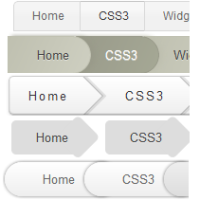 Breadcrumbs are an alternative navigation. Not only do they act as a visual aid to inform the reader about their position in the blog's hierarchy but also give a more structured feel. The previous post was about how to integrate Breadcrumbs into Blogger and this one is a showcase of 5 designs which you can use in place of the default design provided before. All of these designs use CSS3 extensively with no use of images anywhere. Each of them is beautifully styled and should integrate well with your blog's current design.