Make your Blogger Blog Responsive

Responsive Web Design has now become the integral part of the web. With the oncoming of the media queries in CSS3 ,it has become even more easier to implement it into your Blog. In a nutshell Responsive web design makes sure that irrespective of your readers Screen Size, they are able to see your blog with no (Horizontal Scroll-bar)problems. Even then very few Blogger template use it, rest still prefer using the fixed CSS (i.e. explicitly defining widths ).


This can be implemented in Blogger by simply adding a @media tag in the CSS section (b:skin) of your Blog. Media tag works by using a condition ,which defines where the enclosed CSS will apply. Here is a general Syntax of @media tag:


<style>
@media (min-width:200px){
background:blue;
}
</style>

What this does is that it check for all the screen width, and for all those that are atleast 200px & above , it sets the background to Blue. Here you replace min-width with many more type of conditions like height,device-width,etc .For a complete list Check out the Officail W3C page.


Now we will be discussing how you can integrate this awesome thing into your own blog. We will be mainly be focusing on the Horizontal Scrollbar ,making sure that it doesn't appear for all the readers of your Blog. Here are some codes that are supposed to work on every blog, To add them go to

For Old Interface, Go to Design > Template Designer > Advanced > CSS
For New Interface, Go to Templates > Customise > Advanced > CSS


@media(max-width:1295px){
body{min-width:1020px;}
h1{font-size:35px;}
.sidebar .widget{width:215px;}
.content-outer, .content-fauxcolumn-outer, .region-inner{min-width:1020px;max-width:1020px;_width:1020px;}}

@media (max-width:1050px){
body{min-width:880px !important;}
.content-outer, .content-fauxcolumn-outer, .region-inner{min-width:840px !important;max-width:880px !important;_width:880px !important;}
h1{font-size:21px;}
h5{font-size:12px;}}

Here width would be according to your choices. What max-width does is that it applies the CSS to all screen sizes till that value .In normal cases, both the above widths should be less than the total width of blog. For example if you have chosen the width of your blog as 1200px, then make max-widths as 1000px and 800px.

The line 5 & 9 reduces the size of the main Content regions (i.e. is the Post + Sidebar). Sometime the sidebar might be wide and you would also have to reduce its size as done in line 4.

I have integrated this into Stylify Your Blog, check out the screenshots below


The possibilities with this are near endless. Do try playing with this and share your experience.

Dynamic Views type Comment Style

Dynamic Views are one the latest and greatest offering from the people at Blogger. I really liked its Comment style , the one-click and display and hide feature. After doing a bit of research I was able to implement it in normal/default Blogger templates.

Comment style

See Demo


To implement this in your Blogger Blog:


1. Go to Blogger Dashboard.

2. For New Interface ,go to Templates > Edit HTML
For Old Interface ,go to Design > Edit HTML

3. Now tick the Expand Widget Preview option & search for the term </head> tag and insert the following code Before it:


<script src='http://ajax.googleapis.com/ajax/libs/jquery/1.4.2/jquery.min.js' type='text/javascript'/>
<script type='text/javascript'>
$(document).ready(function() {
// hides the comments elements as soon as the DOM is ready
$(&#39;#comments,.avatar-stock img&#39;).hide();

// view the comments on clicking the noted link
$(&#39;.readCom&#39;).click(function() {

if ( $(&#39;#comments&#39;).is(&#39;:hidden&#39;) )
{
$(&#39;#comments&#39;).show(&#39;slow&#39;);
}
else
{
$(&#39;#comments&#39;).hide(&#39;slow&#39;);
}
return false;
});

});
</script>

and now search for the term class='comments' and insert the following code before/above it.


<span class='readCom'><a href='#'><data:post.numComments/> Comments</a></span>

Note: Exclude the 1st line if you already have jQuery present in your template.

What this does: It Inserts a link which displays the number of comments just after the end of the post which can be clicked to display and hide comments similar to the Dynamic Views templates. When the page loads the Comment section is hidden (See Line 5).

This will hide the whole comment section, If you only want to hide the comments and not the comment Box (where you enter the comments ) then replace #comments with #comments-block in the above code.

One thing ,to implement this you will have to have comments embedded under posts, change the settings at Settings > Comments > Comment Form Placement.

Thanks to BloggerMint's Experimental templates for inspiring me

Hosting your JS files on Google Code

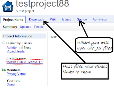
Google Codee ImageGoogle Code is one of those services from Google whose list of benefits is near endless. Its a service which provides free hosting of your Project files including JavaScript files with Unlimited Bandwidth. Even though it is possible to include JavaScript Files into Blogger itself (See how) but sometimes while editing ,due to Blogger's habit to Escape Code automatically it can become a bit frustrating.


Lets Get Started:

1. Go to code.google.com/hosting/ and click on create a new project.


2. Now fill the Details as per your needs, and make sure you set the Version control system as Subversion & the Source code license as Mozilla Public License 1.1 (select something else as per requirement, but this is suited for general use)


3. After creating the project you will be redirected to the Home Screen of your Project which is explained in more detail in the Image below


The rest of the menu items will be needed if you will be hosting a project ,which would require descriptions (Wiki), problem reporting (Issue),etc

4. Now go to Source > Browse > svn > trunk > Create or Upload file.


5. Now you either upload or create a js file you want to be hosted ,with brief description of what its about and Then Click the Commit button


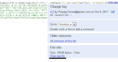
6. After doing this you will be redirected to a Page with the whole code , there in the left side you will see View raw file , click it and copy the URL in the Address bar (This is the Absolute URL of your JS file).


Now you can easyily embed this in your page using the script tag ,for example:


<script src='http://projectname.googlecode.com/svn/trunk/Zen.js' type='text/javascript'/>

A bit of Advice: Even though you can host about 4GB of code, I suggest refraining from Mass Uploading stuff (This even implies to the Download Section). I have first hand experience in this - Got my Project removed ,as I had uploaded a lot of stuff to it ,including the Download packages of lot of my tutorials.

Thanks to Navneet Pandey for pointing out a very grave error in the Post, Changing the Version from Mercurial to Subversion


Have some problems or experiences to share related to Google Code, feel free to share

Embedding Google Groups into Blogger

Google Groups Image
Creating a Discussion Page for your Blog/Website is a good way to let your readers interact with each other. Continuing from my recent post about embedding Vanilla Forum into Blogger ,I would be discussing how easy it is to make and then embed a Google Group into your Blog. Two of its biggest win over the previous tutorial is that it has no hosting issues and Bandwidth limitations. It might not be a classic Forum software ,but its simplicity & easy of use are its major advantages. One of its other plus point is it mail alert feature which keep you informed with whats happening in the group on the real time basis (Surprisingly many of the best known Forum Software lack this baic feature ).


See Demo


Add it into your Blog 


1. Go to groups.google.com/groups/create and fill in the necessary details and Click on Create my group button.


2. Then you will be asked to Add people to the group.

3. Now you change appearance and various other things by going to the Settings menu.

4. Now comes the embedding part , paste the following code into a Static Page


<iframe id="forum_embed" 
src="javascript:void(0)"
scrolling="no"
frameborder="0"
width="900"
height="700">
</iframe>

<script type="text/javascript">
document.getElementById("forum_embed").src =
"https://groups.google.com/forum/embed/?place=forum/forum-name"
"&amp;showsearch=true&amp;showpopout=true&amp;parenturl="
encodeURIComponent(window.location.href);
</script>

Change the forum-name (Line 11) to the name you gave while creating it.

Check out the following Website for In-depth Review of Google Groups.


See Demo


Slick Social Share Buttons for Blogger

Share Image Slick Social Share Buttons is a Wordpress Plugin which adds floating social media Buttons to your blog. I have dismantled and then re-mantled  it so that it can be easily integrated with Blogger. Like many other side sharing Widgets ,you can add many different types of Share Buttons to it but its main feature is aesthetically pleasing On-click Sliding feature which shows these buttons only when the user wants and hides them when not required. It comes with a lot of customization possibilities which we will discuss through the post. I will be discussing the floating panel version here which is the more commonly used one.


See Demo


Adding the Side Floating Buttons


1. Login to your Blogger account.
2. Go to Design > Page Elements. (For New Blogger Interface Go to Layouts)
3. Click Add A Gadget.
4. In Add A Gadget window, select HTML/Javascript .
5. Copy the code below and paste it inside the content box. (See how to Copy Easily)


<style>
#nav-dcssb, #nav-dcssb li {
margin: 0;
padding: 0;
list-style: none;
}
#nav-dcssb {
}
#nav-dcssb li {
padding: 5px;
}
#nav-dcssb li.size-box {
text-align: center;
height: 60px;
}
#nav-dcssb li.size-small {
height: 30px;
}
/* Floater */
.dc-social-float .tab {
cursor: pointer;
height: 44px;
margin-left: -1px;
}
.dc-social-float .dc-social-float-content {
background: #fff;
border: 1px solid #bbb;
padding: 10px;
}
.dc-social-float .dc-social-float-content {
border-radius: 10px; -webkit-border-radius: 10px;
}

/* Slick */
.dc-social-slick .dc-social-slick-content {
padding: 10px;
background: #fff;
border: 1px solid #ccc;
}
.dc-social-slick.vertical .dc-social-slick-content {
width: 78px;
}
.dc-social-slick.horizontal.left #nav-dcssb li.size-small, .dc-social-slick.horizontal.right #nav-dcssb

li.size-small {
height: 60px;
}

.dc-social-slick.top {
top: 0;
}
.dc-social-slick.bottom {
bottom: 0;
}
.dc-social-slick.right {
right: 0;
}
.dc-social-slick.left {
left: 0;
}
.dc-social-slick.right, .dc-social-slick.left {
padding-top: 2px;
background: url(images/bg_slick_top.png) repeat-x 0 0;
}

.dc-social-slick.right .dc-social-slick-content {
border-top: none;
border-right: none;
border-radius: 0 0 0 10px; -webkit-border-radius: 0 0 0 10px;
padding: 10px 10px 20px 10px;
}
.dc-social-slick.left .dc-social-slick-content {
border-top: none;
border-left: none;
border-radius: 0 0 10px 0; -webkit-border-radius: 0 0 10px 0;
padding: 10px 10px 20px 10px;
}
.dc-social-slick.left.horizontal .dc-social-slick-content, .dc-social-slick.right.horizontal .dc-social-

slick-content {
border-radius: 0; -webkit-border-radius: 0;
padding: 10px 10px 18px 10px;
}
.dc-social-slick.top.vertical .dc-social-slick-content, .dc-social-slick.bottom.vertical .dc-social-

slick-content {
border-top: none;
border-bottom: none;
}

.dc-social-slick .tab {
cursor: pointer;
}
.dc-social-slick.top .tab, .dc-social-slick.bottom .tab {
height: 46px;
}
.dc-social-slick.left .tab, .dc-social-slick.right .tab {
width: 46px;
}

.dc-social-slick.bottom .tab {
top: 1px;
}
.dc-social-slick.top .tab {
bottom: 1px;
}
.dc-social-slick.align-left .tab {
margin-left: -1px;
}
.dc-social-slick.align-right .tab {
margin-right: -1px;
}

.dc-social-slick.bottom.align-right.horizontal .dc-social-slick-content {
border-radius: 10px 0 0 0;
-webkit-border-radius: 10px 0 0 0;
}
.dc-social-slick.bottom.align-left.horizontal .dc-social-slick-content {
border-radius: 0 10px 0 0;
-webkit-border-radius: 0 10px 0 0;
}

.dc-social-slick.top.align-right.horizontal .dc-social-slick-content {
border-radius: 0 0 0 10px;
-webkit-border-radius: 0 0 0 10px;
}
.dc-social-slick.top.align-left.horizontal .dc-social-slick-content {
border-radius: 0 0 10px 0;
-webkit-border-radius: 0 0 10px 0;
}

.dc-social-slick.right .tab, .dc-social-slick.left .tab {
margin-top: -2px;
}
.dc-social-slick.right .tab {
left: 1px;
}
.dc-social-slick.left .tab {
right: 1px;
}

.dc-social-slick.horizontal #nav-dcssb li {
float: left;
}
.clear {clear: both;}
</style>
<script type="text/javascript" src="

https://ajax.googleapis.com/ajax/libs/jquery/1.7.0/jquery.min.js"></script>
<script type='text/javascript'

src='http://stylifyyourblog1.googlecode.com/svn/trunk/easingplusslickfloat.js'></script>


<div id="dc-dcssb">
<ul id="nav-dcssb" >
<li id="dcssb-twitter" class="size-box"><script src="http://tweetmeme.com/i/scripts/button.js"

type='text/javascript'></script>
</li>
<li id="dcssb-facebook" class="size-box"><a name="fb_share" type="box_count"

href="http://www.facebook.com/sharer.php">Share</a><script

src="http://static.ak.fbcdn.net/connect.php/js/FB.Share" type="text/javascript"></script>
</li>
<li id="dcssb-plusone" class="size-box"><script type="text/javascript"

src="https://apis.google.com/js/plusone.js"></script>
<g:plusone size="tall"></g:plusone>
</li>
<li id="dcssb-linkedin" class="size-box"><script src="http://platform.linkedin.com/in.js"

type="text/javascript"></script>
<script type="IN/Share" data-counter="top"></script></li>
<li id="dcssb-stumble" class="size-box">
<script src="http://www.stumbleupon.com/hostedbadge.php?s=5"></script>
</li>
<li id="dcssb-digg" class="size-box">
<script src='http://widgets.digg.com/buttons.js' type='text/javascript'></script>
<a class="DiggThisButton DiggMedium"></a>
</li>
</ul>
</div>
<script type="text/javascript">
jQuery(window).load(function() {
jQuery('#dc-dcssb').dcSocialFloater({
idWrapper : 'dcssb-float',
width: '98',
location: 'bottom',
align: 'right',
offsetLocation: 50,
offsetAlign: 50,
center: false,
centerPx: 0,
speedContent: 600,
speedFloat: 1000,
tabText: '<img src="https://blogger.googleusercontent.com/img/b/R29vZ2xl/AVvXsEj_X02TfWR6InCfgnNO6gsxvt9FKXm4GQYLj-7eexerobeM_mhDESbplKMvJNaNmxrNfkMkwAn9nTA0GLpVyvaAFTB90Nh55u6PYw4EOi6T5xASafylW2Wvnq0i4kYf0zj_UtZyupuyoFg/s1600/tab_bottom_floating.png" alt="Share" />',
autoClose: false,
loadOpen: false,
tabClose: true,
classOpen: 'dcssb-open',
classClose: 'dcssb-close',
classToggle: 'dcssb-link'
});
});
</script>


6. Save the gadget.
7. Drag the gadget and reposition it either Right sidebar or Left sidebar (Make it the First Gadget).
8. Click Save button on upper right corner.


Customizing:


1. Alignment & Speed
To change position of the widget , check Line 190-194 with each attribute having the usual meaning. To change the speed check the attribute namely speedContent and speedFloat (Time is in Microseconds).


2. Closed or Open
This widget has a option whether you want these buttons be visible when the page loads or let them remain in the Closed state. To change this option search for "loadOpen" attribute in the code (Line 200) .To let them be visible when the page loads set the option as true .


3. Adding /Removing Buttons
Buttons can be added or deleted easily .To delete any button remove the code in-between the li tags. To add buttons other than those present already just add a li tag with class attribute something like the following code:


<li class="size-box">

----The Button Code----

</li>


4. Making it Appear on Selective Page 
If you want this to appear on only Post pages then you will have to go to Design > Edit HTML (As per new Interface Go to Template > Edit HTML).Tick the "Expand Widget Templates" and Then search for the Title of Gadget (If you have not given any title then give a dummy title like "abcd" and search using CTRF+F for this term) . Now see the following code

<b:widget id='WidgetID' locked='false' title='abcd' type='HTML'>
<b:includable id='main'>
PUT CONDITIONAL TAG HERE
<b:if cond='data:title != &quot;&quot;'>
<h2 class='title'><data:title/></h2>
</b:if>
<div class='widget-content'>
<data:content/>
</div>
<b:include name='quickedit'/>
<b:else/>
<style type='text/css'>
#WidgetID {display:none;}/*to hide empty widget box*/
</style>
</b:if>
</b:includable>
</b:widget>


List of conditional tags


Replace the "PUT CONDITIONAL TAG HERE" in the above code with any one of the thing.


1. Index (list) pages

Index pages include homepage, labels page and yearly archive page.
<b:if cond='data:blog.pageType == "index"'>


2. Post (item) page

<b:if cond='data:blog.pageType == "item"'>


3. Static Page

<b:if cond='data:blog.pageType == "static_page"'>


4. Archive page

<b:if cond='data:blog.pageType == "archive"'>


5. Homepage

<b:if cond='data:blog.url == data:blog.homepageUrl'>


6. Specific page/url

<b:if cond='data:blog.url == "PUT_URL_HERE"'>


Now after putting the conditional tag, Preview the code and then Save.


Having problems, feel free to ask


See Demo

Making Pages Inside Blogger Posts

Pages inside Post ImageContinuing from my recent post about the Page hack in Blogger, I have been asked by some of my readers to implement the same thing inside a Post. Well some might why is it needed in the first place? , the reasoning behind that is to make your Post look a little short (Even when they are not). The method I will be employing is in no ways a clean one and will require to include a JavaScript file individually in each post followed by a full rearrangement (Just Copy-Paste) of the contents.


See Demo


How to add this into your Posts:
1. Firstly we will be adding the following JavaScript to the end of the Post ( In the Edit HTML Tab)


<script src="http://stylifyyourblog1.googlecode.com/svn/trunk/pageinpost.js" ></script>
<script type="text/javascript">
activatables('page', ['page-1', 'page-2','page-3' ]);
</script>

I am assuming that you will be making three pages namely page-1, page-2 & page-3


2. Now either add the CSS to the end of the Post or inside the Edit HTML of the Blog.


<style>
div.content11 {clear: left;padding: 1em;}
div.content11.inactive {display: none;}
ol#toc {height: 2em;list-style: none;margin: 0;padding: 0;}
ol#toc a {padding: 0px 8px 0px;margin: 1px 4px;text-decoration: none;border:1px solid #999;-webkit-border-radius:3px;-moz-border-radius:3px;}
ol#toc a:hover {background-color: #DBECF8;padding: 0px 8px 0px;border:1px solid #204e73;}
ol#toc a:hover span {background-position: 100% -120px;}
ol#toc li {float: left;margin: 0 6px 0 0;}
ol#toc li a.active {background-color: #48f;background-position: 0 -60px;color: #fff;font-weight: bold;}
ol#toc li a.active span {background-position: 100% -60px;}
ol#toc span {background: url(tabs.gif) 100% 0;display: block;line-height: 2em;padding-right: 10px;}
</style>


3. Now Here is the Basic HTML Markup in which you will have to rearrange your Post Content into content  into :


<div class="content11" id="page-1">

The content of Page One

</div>
<div class="content11" id="page-2">

The content of Page Two

</div>
<div class="content11" id="page-3">

The content of Page Three

</div>

<ol id="toc">
<li><a href="#page-1">1</a></li>
<li><a href="#page-2">2</a></li>
<li><a href="#page-3">3</a></li>
</ol>


Here you will observe that first div section is given the Id page-1, which is the link of the first item of the ordered list as well if you see the JavaScript above, you will see how it is being used.


One word of Advice, after pasting the above code (The ol list) in the Edit HTML Tab, if you go to the Compose Tab and then go back to Edit HTML tab ,you will see the links have changed in the href , if you don't revert them back to only # ones, then this will not work. So either add this code just at the end of writing your Post or don't switch to Compose tab :(


This might be a little lengthy way of achieving Pagination inside post, but the results will be better looking and a bit less lengthy posts. Thanks to Chad Guzman & Aliester for suggesting this idea. And I know this script has a lot of space for improvement.


Having problems, feel free to drop by

See Demo


Making Blogger More Professional


Blogger more professional Image
Blogger is known for being easy to learn and navigate around, making it the first stop for most newbie bloggers. The fact that it’s affiliated with Google only adds to the draw of picking it over other blogging platforms. However its one downfall is the misconception that it doesn’t have the same level professionalism that WordPress does, meaning that when many people make the switch to self-hosting they move their Blogger blog over to WordPress instead. Before you decide you’re going to make the switch though, take a look at these tips to making your Blogger account more professional – by the end it’s likely that you won’t want to make the platform switch after all.


Add Pages to Your Blog

One reason that WordPress platform are so popular is that you can add in several different pages , such as an “About Me” page, a “Contact” page, a “Top Posts” page, etc. However bloggers who blog on the Blogger site don’t utilize this option as much as WordPress users – but you should! To add in pages:

1.      Click Posting on the Dashboard (Go to Pages in New Blogger Interface)
2.      You’ll see three different options: New Post, Edit Post, and Edit Pages
3.      Add in as many pages as you want (the current limit is 20 Pages per blog) for different tabs on your homepage

Create Your Own Header

Instead of using the pre-made headers that Blogger provides for you add in your own personality by creating your own. This is the first thing that people see when they click on your site; you want it to be a professional reflection of you as a blogger.


Gadgets

There are a lot of gadgets available out there that you can add in your blog ,such as "Popular Posts" ,"Recent Comments" , "Label Cloud" etc .The thing is to strike the correct balance and not overdo it. Just include those gadgets which you feel will be useful to your readers


Keep it Simple

Don’t overdo it using different customized fonts, instead only use two or three to keep a uniform theme going through your blog site. This will lend to a more professional appearance. Play around with fonts to see which ones work together and look at other professional blogs to see what they’ve used to get an idea for what you should use. Find a template that you like, tweak it to your own preference and then leave it alone. You don’t want to be changing your blog design all the time, only every once in a while. Having a simple design gives a cleaner appearance to your blog.

Making these simple changes will help to give your blog a more polished appearance overall, giving it a more professional appearance without sacrificing the ease of the Blogger platform. Once you’ve made these changes you can start looking into other ways to boost your blog to a more professional level, like adding in AdSense (which Blogger makes very easy to do).

Author Bio
This is a Guest Post by Nancy Parker who was a professional nanny and she loves to write about wide range of subjects like health, Parenting, Child Care, Babysitting, nanny background check tips etc. You can reach her @ nancy.parker015@gmail.com
 
© 2009 Blogger Tips 2013 | Powered by Blogger