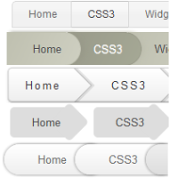
 Breadcrumbs are an alternative navigation. Not only do they act as a visual aid to inform the reader about their position in the blog's hierarchy but also give a more structured feel. The previous post was about how to integrate Breadcrumbs into Blogger and this one is a showcase of 5 designs which you can use in place of the default design provided before. All of these designs use CSS3 extensively with no use of images anywhere. Each of them is beautifully styled and should integrate well with your blog's current design.
Before You get Started
Make sure that you already have Breadcrumbs in your blog. In case you haven't put them , follow this tutorial first before proceeding further. Also if you putting them now , then don't include any CSS mentioned in the steps .
Make sure remove all the CSS related to the Breadcrumbs from your blog
We will be using a common HTML structure for all these design , it is something like
 <div class='breadcrumbs' >
<a class='first' href='#' ><span>Home</span></a>
<a href='#' ><span>CSS3</span></a>
<a href='#' ><span>Widgets</span></a>
</div>
Now lets get started , just add the CSS in your template manually or add it directly using the One-Click button
Design I

Demo
This is the image-less version of the default style.
The credit goes to Jake Rocheleau
Add it directly
Or Add it manually
CSS
.breadcrumbs{list-style:none;margin:0}
.breadcrumbs a:last-child{border-right-width:1px!important;border-bottom-right-radius:5px;-moz-border-radius-bottomright:5px;-webkit-border-bottom-right-radius:5px}
.breadcrumbs a{color:#666;display:block;float:left;font-size:12px;position:relative;text-decoration:none;border:1px solid #D9D9D9;border-right-width:0;background-image:0;filter:progid:DXImageTransform.Microsoft.gradient(startColorstr=#f1f1f1,endColorstr=#f5f5f5);-ms-filter:"progid:DXImageTransform.Microsoft.gradient(startColorstr=#f1f1f1, endColorstr=#f5f5f5)";background-repeat:no-repeat;background-position:100% 0;z-index:1;padding:7px 16px 7px 19px}
.breadcrumbs a:hover{border-top-color:#c4c4c4;border-bottom-color:#c4c4c4;background-image:0 45% #f8f8f8 73%;filter:progid:DXImageTransform.Microsoft.gradient(startColorstr=#f8f8f8,endColorstr=#f1f1f1);-ms-filter:"progid:DXImageTransform.Microsoft.gradient(startColorstr=#f8f8f8, endColorstr=#f1f1f1)";color:#333;-moz-box-shadow:0 2px 2px #e8e8e8;-webkit-box-shadow:0 2px 2px #e8e8e8;box-shadow:0 2px 2px #e8e8e8}
.first,.first:hover{z-index:30!important;border-top-left-radius:5px;-moz-border-radius-topleft:5px;-webkit-border-top-left-radius:5px}
Design II

Demo
The inspiration for this came from a Dribbble shot by Maleika E. A.
Add it directly
Or Add it manually
CSS
.breadcrumbs{list-style:none;margin:0}
.breadcrumbs a{text-decoration:none;color:#444;position:relative;z-index:1;float:left;text-shadow:0 1px 0 rgba(255,255,255,.5);-moz-border-radius:0 100px 100px 0;-webkit-border-radius:0 100px 100px 0;border-radius:0 100px 100px 0;margin:0 -16px 0 0;padding:10px 22px 10px 30px}
.breadcrumbs a:nth-child(odd){border:1px solid #BFC0B0;box-shadow:4px 0 6px 0 #999A8A;background-image:linear-gradient(tobottomright,#BFC0B00%,#CECFC1100%)}
.breadcrumbs a:nth-child(even){color:#FFF;border:1px solid #999A8A;box-shadow:4px 0 6px 0 #BFC0B0;background-image:linear-gradient(tobottomright,#999A8A0%,#A5A895100%)}
.breadcrumbs a:nth-child(even):hover{color:#333}
.breadcrumbs a:nth-child(odd):hover{color:#FFF}
.first,.first:hover{z-index:30!important}
.breadcrumbs a:nth-child(2){z-index:29!important}
.breadcrumbs a:last-child{box-shadow:4px 0 6px 0 transparent!important}
Design III

Demo
All thanks to Showcaze for this
Add it directly
Or Add it manually
CSS
.breadcrumbs{zoom:1;line-height:40px;height:40px;background-color:#FFF;background-image:linear-gradient(tobottom,#FFF,#EEE);-moz-border-radius:5px;-webkit-border-radius:5px;-ms-border-radius:5px;-o-border-radius:5px;border-radius:5px;border:1px #CCC solid;-webkit-box-shadow:inset 0 -1px 1px rgba(0,0,0,0.3), 0 1px 5px rgba(0,0,0,0.1);-moz-box-shadow:inset 0 -1px 1px rgba(0,0,0,0.3), 0 1px 5px rgba(0,0,0,0.1);-ms-box-shadow:inset 0 -1px 1px rgba(0,0,0,0.3), 0 1px 5px rgba(0,0,0,0.1);-o-box-shadow:inset 0 -1px 1px rgba(0,0,0,0.3), 0 1px 5px rgba(0,0,0,0.1);box-shadow:inset 0 -1px 1px rgba(0,0,0,0.3), 0 1px 5px rgba(0,0,0,0.1);letter-spacing:2px;margin:0;padding:0}
.breadcrumbs:before,.breadcrumbs:after{display:table;content:"";zoom:1}
.breadcrumbs:after{clear:both}
.breadcrumbs a{color:#999}
.breadcrumbs > a{position:relative;height:40px;overflow:hidden;float:left;padding:0 40px 0 20px}
.breadcrumbs > a:after{content:'';position:absolute;right:8px;top:-1px;height:40px;width:40px;border-right:3px rgba(0,0,0,0.1) solid;border-bottom:3px rgba(0,0,0,0.1) solid;-webkit-transform:rotate(-45deg);-moz-transform:rotate(-45deg);-ms-transform:rotate(-45deg);-o-transform:rotate(-45deg);transform:rotate(-45deg)}
.breadcrumbs > a:before{content:'';position:absolute;right:11px;top:0;height:40px;width:40px;border-right:1px rgba(0,0,0,0.2) solid;border-bottom:1px rgba(0,0,0,0.2) solid;-webkit-transform:rotate(-45deg);-moz-transform:rotate(-45deg);-ms-transform:rotate(-45deg);-o-transform:rotate(-45deg);transform:rotate(-45deg)}
.breadcrumbs a :last-child{color:#333}
.breadcrumbs > a:last-child span:before,.breadcrumbs > a:last-child span:after{display:none}
.breadcrumbs a:hover{text-decoration:none!important}
.breadcrumbs span:hover{color:#666}
.breadcrumbs > a:hover:after{border-color:rgba(0,0,0,0.2)}
.breadcrumbs > a:hover:before{border-color:rgba(0,0,0,0.3)}
.breadcrumbs span{margin-top:1px;color:#999}
Want to get these updates straight to your Inbox , Then Subscribe !
Design IV

Demo
Partly designed by me
Add it directly
Or Add it manually
CSS
.breadcrumbs{list-style:none;margin:0}
.breadcrumbs a span::after{background:#DDD;content:"";height:2.5em;margin-top:-1.25em;position:absolute;right:-1em;top:50%;width:2.5em;z-index:-1;-webkit-transform:rotate(45deg);-moz-transform:rotate(45deg);-ms-transform:rotate(45deg);-o-transform:rotate(45deg);transform:rotate(45deg);-moz-border-radius:.4em;-webkit-border-radius:.4em;border-radius:.4em}
.breadcrumbs a{text-decoration:none;color:#444;background:#DDD;position:relative;z-index:1;float:left;text-shadow:0 1px 0 rgba(255,255,255,.5);-moz-border-radius:.4em 0 0 .4em;-webkit-border-radius:.4em 0 0 .4em;border-radius:.4em 0 0 .4em;margin:0 2em 0 0;padding:.7em 1em .7em 2em}
.breadcrumbs a:hover,.breadcrumbs a:hover > span:after{background:#f1f1f1;color:#333}
Design V

Demo
Again special thanks to Showcaze for this awesome design
Or Add it manually
CSS
.breadcrumbs{list-style:none;height:36px;line-height:36px;padding-left:36px;margin:0}
.breadcrumbs > a{position:relative;float:left;margin-left:-36px;-moz-border-radius:18px;-webkit-border-radius:18px;-ms-border-radius:18px;-o-border-radius:18px;border-radius:18px;background-color:#FFF;background-image:linear-gradient(tobottom,#FFF,#EEE);-webkit-box-shadow:0 0 5px rgba(0,0,0,0.5);-moz-box-shadow:0 0 5px rgba(0,0,0,0.5);-ms-box-shadow:0 0 5px rgba(0,0,0,0.5);-o-box-shadow:0 0 5px rgba(0,0,0,0.5);box-shadow:0 0 5px rgba(0,0,0,0.5)}
.breadcrumbs> a:before{content:'';position:absolute;z-index:-1;left:-6px;top:-6px;width:100%;height:100%;background:#D5D5D5;-moz-border-radius:22px;-webkit-border-radius:22px;-ms-border-radius:22px;-o-border-radius:22px;border-radius:22px;border:1px #C5C5C5 solid;padding:5px}
.breadcrumbs > a > span{color:#666;float:left;padding:0 46px 0 40px}
.breadcrumbs a{list-style:none}
.breadcrumbs a::before,.breadcrumbs a::after,.breadcrumbs a span::before,.breadcrumbs a span::after{content:"";position:absolute;top:50%;left:0;display:none}
.breadcrumbs a span::before,.breadcrumbs a span::after{background:transparent;margin:-8px 0 0}
.breadcrumbs > a:last-child > span{color:#333;padding:0 46px 0 60px}
.breadcrumbs > a:hover,.breadcrumbs > a:last-child{background-color:#EEE;background-image:linear-gradient(tobottom,#EEE,#DDD)}
.breadcrumbs > a:hover > span{color:#FFF;padding:0 66px 0 60px}
.breadcrumbs > a:last-child:hover > span{padding:0 46px 0 60px}
.first,.first:hover{z-index:30!important}
.breadcrumbs a:nth-child(2){z-index:31!important}
.breadcrumbs a:nth-child(3){z-index:32!important}
Do you have any other designs to add to these ? Feel free to add them via the comments , I will surely do a another post about them. Lastly if you are having any kind of problems then feel free to express them below
Also the new Forum is up so don't forget to check it out


0 comments:
Post a Comment