
Presenting the First Ever Blogger Dynamic View Template on the Web named Elite Classic. Well its a very interesting thing that even though it has been possible to create Dynamic View Templates for a while now yet no one has created it. Coming to the core functionalities of this template ,it is based on the Classic Dynamic View and Supports the Template Designer fully. The modifications done are all CSS based. The reason for its creation was the monotonous look of the Dynamic Views and no real choice of a different style to choose from in being present.
Demo
Download
Screenshot

Complete List of Features
-Responsive Design
-Attractive Post Title
-Sticky Sidebar and Menu
-Stylish commenting system design
-CSS3 Gradients powered Header design
-Full support for Template Designer
-Threaded Reply feature
-90%+ Google Page Speed score
-AJAX Search Box
-Cross browser compatibility except Opera
-Custom Gadget Dock Design
-Attractive web fonts like HomeMade Apple and SunShiney
How to Upload Elite Classic Template ?
In case you are using Standard Template , then firstly Back Up your template.
For Old Interface Users
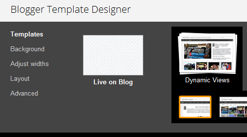
- Go to Design > Template Designer and Under Template sub-heading select the First template under the Dynamic Views Category
- Now go back to Edit HTML
- Click on Choose File button
- Select the .XML template file Extracted from Zip and click Open button
- Click On Upload button
- In the Keep Widgets Option, Click on DELETE WIDGETS Button
- You are Done!!
For New Interface Users
- Go to Template > Customise and Under Template sub-heading select the First template under the Dynamic Views Category
- Now go back to Template and Click the Backup/Restore button in the Top Right

- Click on Choose File button
- Select the .XML template file Extracted from Zip and click Open button
- Click On Upload button
- You are Done!!
How to Change Fonts and lots of Other things ?
Since this template is Support Blogger Template Designer, so
Go to Design > Template Designer tab (New Interface users go to Template > Customise )
You will find Background Option and Advanced Options.
Play around to get your own unique color Scheme.
Note: In case both these methods don't work , then simply copy the following CSS in the Advanced > Add CSS Section of the Template Designer of your Dynamic Template:
#gadget-dock {right:0px !important;}
.title a:hover {text-decoration:none !important; }

.header-bar{/* IE10 */
background-image: -ms-linear-gradient(top, #FFFFFF 0%, #C6AEC7 100%) !important;

/* Mozilla Firefox */
background-image: -moz-linear-gradient(top, #FFFFFF 0%, #C6AEC7 100%) !important;

/* Opera */
background-image: -o-linear-gradient(top, #FFFFFF 0%, #C6AEC7 100%) !important;

/* Webkit (Safari/Chrome 10) */
background-image: -webkit-gradient(linear, left top, left bottom, color-stop(0, #FFFFFF), color-stop(1, #C6AEC7)) !important;

/* Webkit (Chrome 11+) */
background-image: -webkit-linear-gradient(top, #FFFFFF 0%, #C6AEC7 100%) !important;

/* Proposed W3C Markup */
background-image: linear-gradient(top, #FFFFFF 0%, #C6AEC7 100%) !important;
-moz-box-shadow: 0 0 0px 0px transparent !important;
-ms-box-shadow: 0 0 0px 0px transparent !important;
-o-box-shadow: 0 0 0px 0px transparent !important;
-webkit-box-shadow: 0 0 0px 0px transparent !important;
box-shadow: 0 0 0px 0px transparent !important;}

#header .header-drawer.sticky {top:65px !important;}

#header .header-drawer {-moz-box-shadow: 0 0 0px transparent !important;
-ms-box-shadow: 0 0 0px transparent !important;
-o-box-shadow: 0 0 0px transparent !important;
-webkit-box-shadow: 0 0 0px transparent !important;
box-shadow: 0 0 0px transparent !important;}

.viewitem-panel {border-top: solid 0px transparent !important; }

.comment-content{white-space: pre-wrap;width: 95%;word-wrap: break-word;}
.comments .comments-content .comment {background: white;position: relative;-webkit-border-radius: 0px 100px 120px;-moz-border-radius: 0px 100px 120px;-o-border-radius: 0px 100px 120px;border-radius: 0px 100px 120px;padding:5px;}
.blogger-comments .comments-content  {background:White !important;}
span.comment-actions, .continue {width:120px;background: #F1F1F1;border-radius: 20px 20px;-moz-border-radius: 20px 20px;-webkit-border-radius: 20px 20px;-o-border-radius: 20px 20px;text-align:center;font-weight:bold;text-decoration:none !important;}
span.comment-actions:hover, .continue:hover {background: #EBDDE2;text-decoration:none !important;}
.secondary-text{padding: 6px 12px 6px;text-decoration:none !important;}
.comments .comment .comment-actions a:hover{text-decoration:none !important;}
.comment-replies span div ol div li span {display:none !important;}
.comments .thread-toggle {background: #F3F3F3;border-radius: 20px;-webkit-border-radius: 20px;-moz-border-radius: 20px;-o-border-radius: 20px;padding: 6px 12px 6px;font-weight: bold;}
.comments .thread-toggle:hover {background: #EBDDE2;}
.comments .comment-block {padding: 11px !important;margin-left: 48px;position: relative;left: 60px;background:#F1F1F1;border-radius: 10px;-webkit-border-radius: 10px;-moz-border-radius: 10px;-o-border-radius: 10px;width: 400px;}
.comments .avatar-image-container img , .comments .avatar-image-container img {overflow:visible !important;width:40px !important;max-width:40px !important;}
.blogger-comments .comments-content .comment-replies {background:white !important;}
.comments .avatar-image-container {width:40px !important;background: #F1F1F1;padding: 5px;border-radius: 100px;}
.avatar-image-container img,.avatar-image-container a img, .avatar-image-container {border-radius:20px;position:relative;height:40px;width:40px;background-clip:padding-box;}
#gadget-dock {right:0px !important;}
#header .header-drawer.sticky {top:65px !important;}
.blogger-comments .comments-content .comment {border-bottom: 1px solid White;!important;}
.comments .avatar-image-container {max-height:50px !important;}
.comments .comments-content .comment-header {width: 450px;background:#F1F1F1;position: relative;left: -73px;}
.comments .comments-content .user {font-style: normal;font-weight: bold;position: relative;left: 80px;}
.comments .comments-content .datetime {position: absolute;left: 270px;}
.comment-thread ol div.continue {display:none !important;}

 .viewitem-content { background-color: #EBDDE2!important;
border-radius:120px !important;-webkit-border-image:url('http://www.blogger.com/img/blank.gif') !important;border-image:url('http://www.blogger.com/img/blank.gif') !important;-moz-border-image:url('http://www.blogger.com/img/blank.gif') !important;-o-border-image:url('http://www.blogger.com/img/blank.gif') !important;-ms-border-image:url('http://www.blogger.com/img/blank.gif') !important;}
.article .article-header .title {background-color: #EBDDE2!important;font-size: 30px !important;}
.article .article-content img:not(.deferred)  {border: 8px solid transparent;
-webkit-box-shadow: 0 0 8px rgba(0, 0, 0, 0.3);
-moz-box-shadow: 0 0 8px rgba(0, 0, 0, 0.3);
box-shadow: 0 0 8px rgba(0, 0, 0, 0.3);
-webkit-background-clip:  padding-box;-webkit-border-image:url('http://www.blogger.com/img/blank.gif') !important;border-image:url('http://www.blogger.com/img/blank.gif') !important;-moz-border-image:url('http://www.blogger.com/img/blank.gif') !important;-o-border-image:url('http://www.blogger.com/img/blank.gif') !important;-ms-border-image:url('http://www.blogger.com/img/blank.gif') !important;
-moz-background-clip: padding-box;
background-clip: padding-box;}


.gadget-icons {background-color:salmon !important;}
#gadget-dock {background-color: transparent !important;}
.gadget-title {background-color: gold !important;}

.gadget-selected .gadget-title {
background-color: gold !important;
border-radius: 0px 0px 1000px 1000px !important;
text-align: center !important;
}

.gadget-selected .gadget-icons ,.gadget-content ,.gadget-container, .gadget-selected.gadget-dock-overflow-bottom .gadget-container    {
background-color: yellowGreen !important;
}


li.item {
background-color: #EBDDE2!important;
-moz-border-image: url('http://www.blogger.com/img/blank.gif') 2 2 2 2 / 2px 2px 2px 2px repeat !important;
border-radius:120px !important;-webkit-border-image: url('http://www.blogger.com/img/blank.gif') !important;border-image: url('http://www.blogger.com/img/blank.gif') !important;-o-border-image: url('http://www.blogger.com/img/blank.gif') !important;-ms-border-image: url('http://www.blogger.com/img/blank.gif') !important;
}
#header .header-drawer {background-color: #C6AEC7 !important;border-radius: 0px 0px 20px 20px !important;}
.ss,.blogger-gear , .feedback , .Flipcard, .Magazine, .Mosaic, .Sidebar, .Snapshot, .Timeslide, .Classic, #views {display: none !important;}
#header #pages::before {
border-left: solid 1px transparent !important;}


#header .tabs li {font-size:20px;}

.entry-title {  word-wrap: break-word !important;

 padding: 0 25px;
 height: 40px;

 color: #301607;

 background-color: #c94700;
    background-image: -webkit-gradient(linear, left top, left bottom, from(#c94700), to(#b84100));
    background-image: -webkit-linear-gradient(top, #c94700, #b84100);
    background-image:    -moz-linear-gradient(top, #c94700, #b84100);
    background-image:     -ms-linear-gradient(top, #c94700, #b84100);
    background-image:      -o-linear-gradient(top, #c94700, #b84100);
    background-image:         linear-gradient(top, #c94700, #b84100);

    border-bottom: 1px solid rgba(255, 255, 255, 0.3);

 position: relative;
 float: left;
 clear: left;

 font-size: 32px;
 line-height: 40px;
 text-shadow: 1px 1px 0 rgba(255, 255, 255, 0.3);

    border-bottom-right-radius: 20px 5px;
 }

.entry-title:after {
 content: "";
 display: block;
 width: 40px;
 height: 0px;

 position: absolute;
    right: 0;
    bottom: 4px;
    z-index: 20;

 border-bottom: 80px solid #de6625;
 border-right: 80px solid transparent;

 -webkit-transform: rotate(90deg);
    -webkit-transform-origin: right bottom;
    -moz-transform: rotate(90deg);
    -moz-transform-origin: right bottom;
    -o-transform: rotate(90deg);
    -o-transform-origin: right bottom;
    -ms-transform: rotate(90deg);
    -ms-transform-origin: right bottom;
    transform: rotate(90deg);
    transform-origin: right bottom;
 }

.entry-title:before {
 content: "";
 display: block;
 width: 20px;
 height: 0px;

 position: absolute;
    right: 0;
    bottom: 4px;
    z-index: 10;

    border-bottom: 80px solid rgba(0, 0, 0, 0.3);
 border-right: 80px solid transparent;

 -webkit-transform: rotate(80deg);
    -webkit-transform-origin: right bottom;
    -moz-transform: rotate(80deg);
    -moz-transform-origin: right bottom;
    -o-transform: rotate(80deg);
    -o-transform-origin: right bottom;
    -ms-transform: rotate(80deg);
    -ms-transform-origin: right bottom;
    transform: rotate(80deg);
    transform-origin: right bottom;
 }

.entry-title:after {
 width: 0px;
 height: 40px;

 position: absolute;
    right: -160px;

 border-left: 80px solid #de6625;
 border-bottom: 80px solid transparent;

 -webkit-transform: none;
    -moz-transform: none;
    -o-transform: none;
    -ms-transform: none;
    transform: none;
 }
.hfeed {margin-top:50px;}
#header .header-bar .title h1 {font-size:39px !important;}

.article .article-content ,  .viewitem-panel .article  {background-color: #EBDDE2 !important}
Feel free to share your opinion about this template and any problems that you face while implementing it
Demo
Download


0 comments:
Post a Comment